Digital Brutalism | Stop Decorating Your Notes and Start Writing
Setting up the workspace became the work. The case for the plain page, what it costs, and an honest account of where our own app sits.
Somewhere in the last few years productivity turned into a look. Dashboards with cover images, pastel palettes, an emoji for every folder, a weather widget above the day's plan. The tools grew to support it, and the screenshots got beautiful.
The backlash has a name now: digital brutalism. Plain type, no ornament, a cursor on an empty page. Before dismissing it as fashion, it is worth separating what is actually true in the argument from what is posturing, because both are in there.
Setting up the workspace became the work
The failure is specific, and most people can date it.
A beautiful page raises the cost of writing badly in it. A dashboard that looks like a magazine spread invites finished thoughts. But finished thoughts are the last five percent of thinking; the rest is half sentences, contradictions and things you will delete. If the page is too nice for that, the messy part goes somewhere else, usually nowhere.
Arranging the system feels like doing the work. Choosing icons, rebuilding a board, reworking a template: all of it produces the sensation of progress with none of the substance. The most honest test is a count. If you have spent more time on the system this month than the system saved you, it is a hobby, and hobbies are fine as long as they are labelled.
The tool gets slower as it gets prettier. Widgets, images and a dozen linked views cost load time, and load time is where a thought goes missing. A tool you wait four seconds for stops being the place you capture things and becomes the place you file them later, which in practice means never.
What brutalism actually is
In architecture, brutalism leaves the material exposed: concrete stays concrete, the structure of the building is the surface of it, and ornament is treated as a lie about what the thing is made of.
In software the equivalent is an interface that admits it is a tool. Plain type, few colours, structure you can see, nothing animated for the pleasure of it. Not a style applied on top, but the absence of one.
The useful part of the idea is not the ugliness. It is the removal of decisions. If a page cannot be styled, the only thing left to do with it is write in it, and that is the whole mechanism: attention goes where the options are, so a tool with fewer options leaves more attention for the text.
Where the argument goes too far
Taken literally, brutalism becomes its own performance, with people competing over how raw their setup is. Three things it gets wrong.
Visual structure is not decoration. A heading that looks like a heading, a checked box that reads as checked, colour used to separate what is done from what is not: these carry information, and stripping them costs comprehension. Plain does not have to mean undifferentiated.
Some people need the page to be inviting. A journal nobody wants to open is not a journal. If a warm background makes someone write three days a week instead of one, the background is doing real work, and telling them it is fluff is just fashion in the other direction.
A folder of text files is not a system. Plain text has no board, no reminder, no view of the week. For some work that is the point; for a lot of work the structure is the reason the tool exists at all, and the brutalist answer is to rebuild it by hand in scripts, which is the same time spent in a different costume.
The rule that survives both extremes: decoration that lives in the file is a cost, decoration that lives in the window is free. Colours and fonts you can change at any time cost you nothing in the text. A template with twelve linked databases is a structure you will maintain for years.
The plain setup, in practice
If you want the benefit without the ideology, this is roughly the shape.
One inbox and no decision at capture. A hotkey, a blank page, type. Where it belongs is a question for later, and the daily note answers it by default: the date is the filing.
Markdown rather than a formatting bar. A dash for a list, two asterisks for emphasis, a hash for a heading. Hands stay on the keyboard, and what you typed is what is stored.
Three columns, not twelve. A board with waiting, doing and done says everything a personal board needs to say. Extra columns are places for cards to hide.
One weekly pass. Fifteen minutes on Friday to clear what is done and delete what you have skipped twice. That single habit replaces most of what templates promise, and the argument for it is in disposable notes.
Structure only where it pays. A template is worth it when you fill in the same shape repeatedly: a meeting, a weekly review, a bug report. It is not worth it as a picture of how organised you intend to be.
Where we sit, honestly
TaskNote is ours, and on this topic we are not the pure article.
We ship themes, paper textures, a font picker, coloured notebooks and a selection menu that appears over the text. A serious brutalist would point at the texture picker and laugh, and they would be right to.
What we did do is choose the defaults, and then build the switch that takes the rest away.
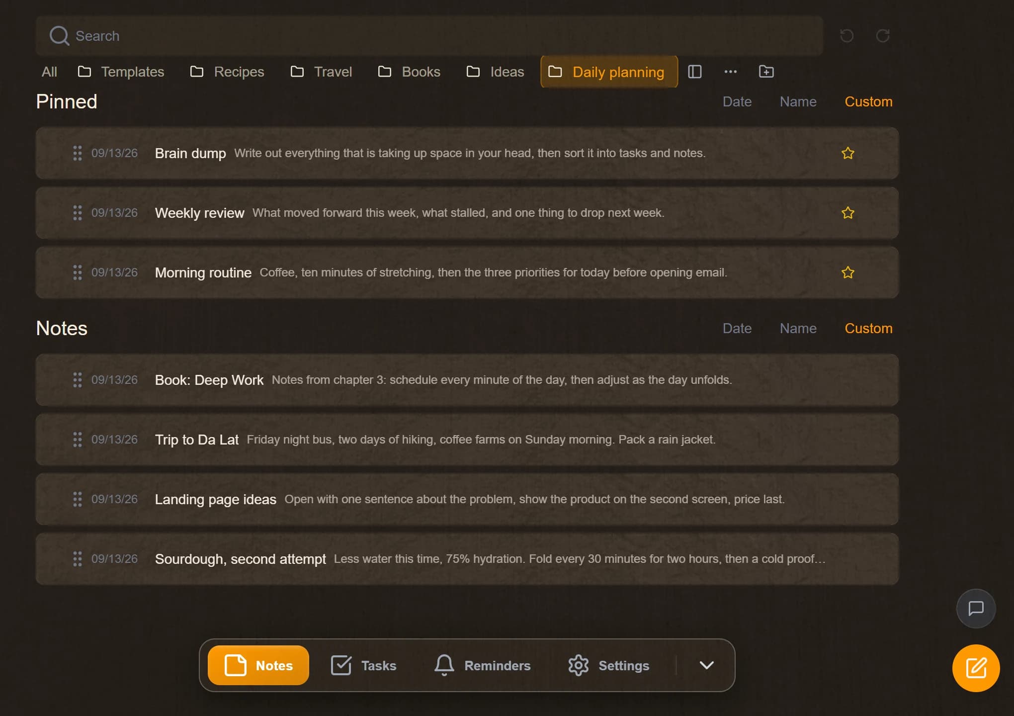
Open the app and you get a dark window, one column of text and a cursor: the decoration is off until you go looking for it, and it lives in a panel rather than on the page. Notes are Markdown under the surface, so nothing you type is trapped in a layout. The kanban board has three columns and no database views to configure. On the Windows app the window is up in about nine tenths of a second, which is the part of the brutalist argument we take most seriously: a tool you wait for is a tool you stop using for capture.
And there is a focus mode. One button in the note takes the window fullscreen, the status line steps back until the pointer comes down to it, and what is left is a column of text on a dark screen: no list, no board, no tabs, nothing of the application visible at all. Escape brings the room back. It is the brutalist reading of our own app, available on demand rather than imposed, which is the arrangement we think is actually right: plain by default, bare when you ask, decorated if that is what gets you writing.
If you want the genuinely bare version, it exists and we will not pretend otherwise: a plain text editor over a folder, files on disk, nothing between you and the text. You will build the board and the reminders yourself. That is a real trade, and for some people the right one.
The short version
The useful half of digital brutalism is this: every decision the interface offers you is paid for out of the attention you came to spend on the work, and most of those decisions are about appearance. Turn the ornament off, keep the structure that carries meaning, and judge the setup by one number: how much of it you maintain versus how much it saves you.
Then stop reading about productivity and go write the thing.
Questions
- What is digital brutalism in software?
- An interface that looks like a tool rather than a magazine: plain type, visible structure, no ornament. The name is borrowed from the architecture, where the material is left exposed instead of being clad in something prettier.
- Why do productivity templates stop working?
- Because maintaining them becomes the task. A layout with twelve linked databases needs upkeep, and the upkeep feels like progress while the actual work waits. The test is simple: if you have spent more time on the system this month than it saved you, it is a hobby.
- Is a plain text notes app better than Notion?
- For capture, usually yes, because there is nothing to decide before you type. For structured team work with databases and shared views, a heavier tool earns its weight. Most people need both, and most people use only the heavy one.
- Does an ugly app actually make me more productive?
- The plainness is not what helps. What helps is that a page with no formatting decisions in it lowers the cost of writing something unfinished, and unfinished writing is where most thinking happens.
- Is TaskNote a brutalist app?
- Not by construction, and we would rather say so: it ships themes, paper textures, a font picker and coloured notebooks. It can be run as one, though. The defaults are plain, the decoration lives in a panel you never have to open, and focus mode takes the window fullscreen with nothing on screen but the text.
minimalismworkflowmarkdown